给博客增加深色模式支持
目前主流操作系统(macOS Mojave, Windows 10, iOS 13, Android 10)都已经支持深色模式。最近也给博客主题加上了深色模式(Dark Mode)的支持,本文做一些记录。
Dark Mode ≠ Night Mode
首先需要明确一个概念,深色模式不是夜间模式。
从使用场景来说,夜间模式是在弱光环境下使用(比如在被窝里),主要目的是保护眼睛,减少强光对眼睛的刺激;而深色模式则没有这个限制,在大白天也能正常使用(我在 macOS 上就常年开着深色模式),可以理解为 Dark Mode 是一个黑色主题。
从功能上来说,夜间模式就是为了夜晚使用不刺眼(前面提过);而深色模式有如下功能(个人总结)
- 省电。现在很多手机都使用 OLED 屏幕,OLED 屏幕的每个像素点是独立发光的,黑色像素点不发光。
- 让用户更加专注。大片留白会分散注意力。
如何实现
Media Query
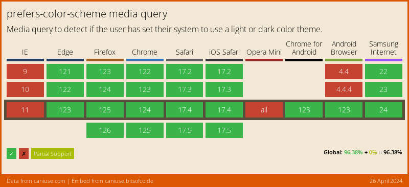
可以通过 CSS 媒体查询 prefers-color-scheme 来判断系统当前的主题,兼容性如下(数据来源 caniuse)。
其实只要系统支持深色模式就支持特性,所以完全可以放心使用。
/* normal/light css */@media (prefers-color-scheme: dark) {/* dark css here */}
落地到具体实现方式有两种:CSS Variable 和 Override。
CSS Variable
如果网站本来就是使用 CSS Variable,那就再定义一份深色模式的 color scheme 即可。这是最简单的方式,对于不支持 CSS Variable 的客户端也有 polyfill。如果你的构建工具使用的是 PostCSS,那配合 postcss-css-variables 插件可以实现更好的兼容性。
:root {--color-text: #000;}@media (prefers-color-scheme: dark) {:root {--color-text: #fff;}}body {color: var(--color-text);}
CSS Override
但如果网站由于历史原因或 trade-off,没有使用 CSS Variable,也可以通过覆盖 CSS 样式的方法实现。比如我的博客,早期没有选择 CSS Variable,打算迁移时发现工作量还是挺大的,就直接暴力覆写 CSS 了(简单粗暴,风险小)。
我的方案是写了一个 mixin,然后全文搜索用到颜色的地方,通过 mixin 覆写一份深色主题。
@mixin dark {@media screen and (prefers-color-scheme: dark) {@content;}}body {color: #000;@include dark {color: #fff;}}
颜色选择
敲定实现方案后,现在又有一个世纪难题,如何选择合理的颜色?
- 深色颜色要能同时兼顾白天和夜晚的使用场景。
- 深色模式并不是一劳永逸的设置绝对黑底白字,两者的对比度是最高的(21:1),这容易产生阅读疲劳,不利于长时间阅读。
站在巨人的肩膀上,通过借鉴一些设计比较好的产品是如何实现深色模式的,再基于实际情况,选择适合自己的颜色方案。
背景色
背景色有两种取法:选择中性黑或带有自己品牌颜色的“黑”。
iOS 的系统界面使用纯黑 #000000,这样的好处是可以省电;Twitter 的黑是带有深蓝色的 #15202b;而 Material Design 建议使用 #121212作为背景色,说是深灰色相比纯黑可以更好表达。
因为我的博客也没有特别的品牌颜色,最终选择和 Material Design 一样的 #121212。
文字
文字尽量不使用纯白,亮度太高刺眼,可以选择稍微暗�一点的颜色。这里我直接抄了 Material Design 的作业。
When light text appears on dark backgrounds it should use the following opacity levels:
- High-emphasis text has an opacity of 87%
- Medium-emphasis text and hint text have opacities of 60%
- Disabled text has an opacity of 38%
- 正文颜色使用
hsla(0,0%,100%,.87) - 标签、时间等辅助元素使用
hsla(0,0%,100%,.6)
颜色对比度
选取好颜色后接下来就是仔细检查网站上各个元素的颜色是否符合 WCAG 2.0 标准。该标准主要是针对有视觉障碍用户,保证你的内容对他们来说是可读的。对于颜色对比度的要求如下:
1.4.3 Contrast (Minimum): The visual presentation of text and images of text has a contrast ratio of at least 4.5:1, except for the following: (Level AA)
- Large Text: Large-scale text and images of large-scale text have a contrast ratio of at least 3:1;
- Incidental: Text or images of text that are part of an inactive user interface component, that are pure decoration, that are not visible to anyone, or that are part of a picture that contains significant other visual content, have no contrast requirement.
- Logotypes: Text that is part of a logo or brand name has no minimum contrast requirement.
1.4.6 Contrast (Enhanced): The visual presentation of text and images of text has a contrast ratio of at least 7:1, except for the following: (Level AAA)
- Large Text: Large-scale text and images of large-scale text have a contrast ratio of at least 4.5:1;
- Incidental: Text or images of text that are part of an inactive user interface component, that are pure decoration, that are not visible to anyone, or that are part of a picture that contains significant other visual content, have no contrast requirement.
- Logotypes: Text that is part of a logo or brand name has no minimum contrast requirement.
主要是要满足这两点:
- AA 级:文字与背景的对比度至少为 4.5:1,大号文字为 3:1。
- AAA 级:文字与背景的对比度至少为 7:1,大号文字为 4.5:1。
你可以用 Chrome Devtools 逐一查看各个元素的对比度:

也可以通过 Lighthouse 一键检测网页上所有的元素。
如果有不符合标准的颜色,可以通过 这个网站 选取合适对比度的颜色。
层级表现
深色模式下表现层级无法通过阴影实现,因为背景已经是深色,阴影效果会被弱化。如果要表现不同的层级,可以通过背景色区分。比如我的博客在移动端右上角会有一个下拉菜单,在深色模式下取消了原本的阴影,使用亮一点的灰色作为背景。
